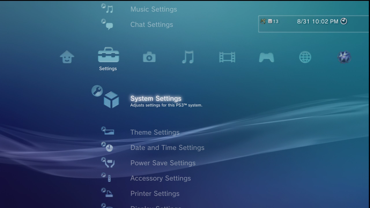
Have you ever wondered which is the most beautiful dashboard – i.e. the interface that welcomes you when you turn it on, ready to start a game – that you have ever encountered on a console?\r\nThe curious question appeared between the ResetEra forum pages, and I have to say the responses were quite interesting. In fact, according to most of the players who spoke, the XMB would be the best console dashboard ever.\r\nThis is the interface proposed at the time by the PS3, which offered a horizontal list of icons on a minimal background with customizable colours. Once the icon was selected, it was possible to browse the different items vertically. By going to the games column, for example, it was possible to see the games stacked vertically, while moving to the right or left you moved to other console screens.\r\nWhat makes this UI particularly appreciated by players is the fact that was customizable (the themes of the icons, colors and background could be changed), but not only that: many also mention the immediacy of use and the absence of advertising banners intended to sponsor products appearing on the console’s digital store, as perhaps happens today – among banners that refer to Plus, or Game Pass.\r\nOthers, even more nostalgic, instead mention the name of the Nintendo Wii dashboard, characterized by its light colors and rectangles with rounded corners, which had to be pressed like real buttons on a site to navigate between the different sections.\r\nThe PSP dashboard is also mentioned by someone, which not surprisingly was based on the PS3’s XMB, while others claim to appreciate today’s console dashboards, but only hate the presence of store banners.\r\nEven the final interface of the Xbox 360, full of angular boxes that in a certain sense refer to the logic of Windows, has had some mention .\r\nThe most loved, however, emerges as XMB: we can therefore say that the minimal and clean design wins over richness (sometimes perhaps too much\
The coolest dashboard ever in a console? The players have no doubts